Monday, June 4, 2012

Project #5 You Are The Curator!

“Greek and Roman Culture”

My task in this writing paper is different from the others field trips reaction. I am going to talk about my exhibition and experience at the metropolitan museum of art. In this trip we were ask to choose between MOMA museum and MET museum. I chose the metropolitan museum because it is good to see and learn all the beautiful stuffs that they collect from every place.

I chose this theme because it is related with the exhibitions and what they represent for us. I want the viewer see how back in the days the history and culture were so special for an artist, also I want them to learn something new about other cultures. My theme contains specific description about the exhibitions I chose.

One of the works that I would like to consider is from the European paintings and sculpture, from the artist Georges Seurat Study for “A Sunday on La Grande Jatte”. This artist made this painting so special because it shown how people dressed in those days, and the way clever people lived. This exhibition is related with my theme because you can see culture.

This painting is from Greek and Roman Art, even though does not have any similarity with the appearance, but it could be related in other way, the painting is called “Terracotta”. This type of painting shows people’s beliefs and their creative minds, for me this is a good example of culture. Even though it is only a jar with two men, this maybe represented also what they thought about culture...

My third work is from Modern Art, the artist is Joan Miro “Vines and Olive Trees” Tarragona. This painting is similar with European Painting, because it has the same structure. At the same time this painting has its own history about how people survived during that period, the colors that it has shows similarity with others artist’s paintings.

Finally I would like to present my project in connection with my field trip. My experience in MET was wonderful I had a lot of fun there and I learned about different cultures all over the world. I learned the similarity between two different artists and time, since this is the last field trip of the class, I should say that I gained something going to different museum.


Hirschfeld Workshop
"Terracotta Krater"
Greek and Roman Art

"Bronze Mirror"
Greek and Roman Art

"Glass Gladiator cup"
Greek and Roman Art

Kephisodotos
" Marble Statue of Eirene"ca. A.D. 14–68
Greek and Roman Art

Ennion
"Glass hexagonal amphoriskos"
1st half of 1st century A.D
Greek and Roman Art

"Gold phiale (libation bowl)"
1000 B.C.-A.D. 1
Greek and Roman Art

"Sarcophagus with a Greek Physician"
A.D. 1-500
Greek and Roman Art

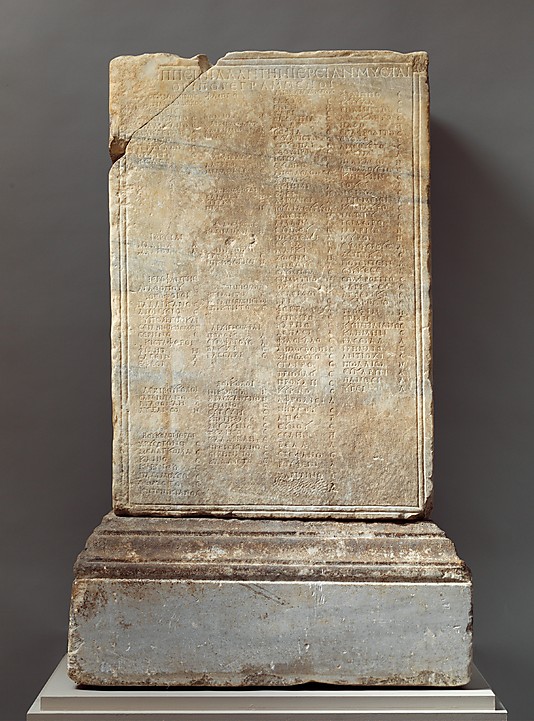
"Marble inscribed statue base"
A.D. 1-500
Greek and Roman Art

Ergotimos
" Terracota stand"
1000 B.C.-A.D. 1
Greek and Roman Art

Ɖdouard Manet
"The Spanish Singer"
A.D. 1800-1900
19th-and early 20th- Century European Paintings and Sculpture


Francisco De Goya y Lucientes
"Majas on a Balcony"
European Paintings


Barnett Newman
"Concord"1949
Modern and Contemporary Art


Jackson Pollock
"Pasiphaƫ"
A.D. 1900-present
Modern and Contemporary Art


Camille Corot
"A Woman Gathering Faggots at Ville-d'Avray"
A.D. 1800-1900
European Paintings


Pieter Bruegel the Elder
"The Harvesters"A.D. 1400-1600
European Paintings

Thursday, May 24, 2012

"Chelsea Galleries Reaction "

In this essay, I was asked to go to Chelsea Galleries and pick up two artists works which I think I would like to collect and I would not to collect. I am going to present my opinion about what I saw in these galleries, also present my works as well. I chose two artists from different galleries; my first artist was Rachel Harrison (Gallery: Greene Naftali), and the second one was Gilbert & George (Gallery: Lehmann Maupin).

My first visit was in Gallery: Greene Naftali and the artist on display was Rachel Harrison. What I liked from this place was the colors, and everything was neat and clean, hers works was always with colors and everything was so feminine. I think Harrison’s works are good investment because you can see the difference between hers works and others. Hers works are beautiful and you can have the capacity to visualize what she tried to say, if I were an artist of course I would collect hers works.

My second experience was in Gallery: Lehmann Maupin and the artists on display were Gilbert & George. What I disliked about this exhibition was that everything was posted in some frames with messages on it. I think this is not a good investment because I could not see ART on those frameworks everything was just written messages, even though I have learned that anything can be art, these works did not catch my attention.

In this paragraph I am going to talk about my two examples of each gallery. My first example of work is from Gallery: Greene Naftali "Hoarders" This work of art seemed to me beautifu, this work may imply to women’s beauty somehow. My second example is from Gallery: Lehmann Maupin “Girl”, this work of art was not quite good in my opinion because it was talking about some humility thing about women and its message was to scared people, talking about murder, missing people etc.

In conclusion my visit to Chelsea Galleries was amazing I could see artworks very simple, also wonderful. Even though it was not on the galleries list of our task I saw a lot of beauty and creative images on others galleries. In my opinion everything was interesting as well our trip. Every collection the artist may have is for some purpose in life, and I know a lot of people would like to collect anything from an artist even the less significant.

Rachel Harrison
"All in The Family"
2012

Rachel Harrison
"Hoarders"
2012

Gilbert & George
" Girl "
2011

Gilbert & George
" Arson"
2011

Thursday, May 10, 2012

" Sculpture Center Reaction"

In our Field trip 4 we went to “Sculpture Center” where our task was to find three artworks. This experience was a little bit awkward, because the place and the work of arts were quite different from others works I have seem, and in my opinion I did not understand what was I suppose to do about the space and these works. In this writing paper I am going to talk about my three works which I found interesting, and what is the meaning of the space and installation, “Untitled”, “Graphite Piece”, and “Rope Piece” by Bill Bollinger.

My first work is “Untitled” by Bill Bollinger, this work is strange for me because I did not find the meaning of the space or installation, and it did not catch my attention at all. Although, I could see that the space of the work was without color, everything was neutral. The artwork is affected by the space, because the tank is solid and does not have like a specific place, so someone can put it anywhere.


My second work is “Graphite Piece”, I found this work interesting because is an empty room with a painting floor. I think this work has something meaningful about the space, maybe the room is the place where someone could create art in it. The space of the work is very isolated, and I could not find out the purpose of this room.

My third work is “Rope Piece”; this work is as the others unusual for me. This work is a rope that is connected with the ceiling. I think the space of this work is huge room with solid walls and a rough ceiling. I think the place is a little old, and maybe for that I could perceive the work. This work has to do with a piece of rope that was installed in a neutral space too.

In conclusion this experience was strange for me because I think art is something with beauty, and with inspiration. Space has to do with everything in a room; I think those works were pretty strange and with this experience I could learn that art is everything in this world. My works that I picked up were very interesting in some way, even though I understood a bit about this homework.


Bill Bollinger
"Untitled" 1970


Bill Bollinger
"Graphite Piece" 1969

Bill Bollinger
"Rope Piece" 1969

Sunday, April 29, 2012

Quiz Make -Up

In this writing paper I was asked to pick up from ART21, an artist with two works that I liked and another one I disliked. I am going to present my two pieces, which I found interesting and beautiful, and present my opinion about my taste in art. I chose my two works from David Altmejd which are “The Vessel” and “The Swam”. This two works are example of the imagination an artist can has and the ability to do things with our own hands.

My first work is called “The Vessel”; I liked this piece of work because it represents a different way of art and in some way changes. The way human body can express a message is a good example of everything that is called art in this world; Altmejd did this work making connection with a real ears to shape the form and the visual structure. This work really liked me because he was showing his own values, and I like to see freedom in everything in life, also the way he could create his pieces by hand that is really amazing.

My second artwork which I dislike is called “The Swarm”. I disliked this one because I did not like the type of things he made, even though it has some interesting parts I did not like it at all. I did not see anything amazing about it and the message was not clear I got confused in some way. The structure was all around; everything was apart so I had to figure it out by myself to understand the work.

Therefore Altmend had made a good project with his works that I chose. I found that his message is not so hard to know, I think he is unique, and tried to communicate his freedom of communication with his works. In my opinion this is fantastic; if someone cans shows his freedom using art, this a good example for everyone else to try it. I do not know if these works reminds me of something, but made me think about the human body the nature.

In conclusion these two artworks are example of good art and bad art from my perspective. Even though, I have learned that there is no such of thing bad or good about art, but everyone has different opinions about art and taste. In addition, art has no wrong answer or opinions and that is why I like to express what I think.
"The Swarm"

"The Vessel"

Sunday, April 22, 2012

"Design in our Lives"

In our third field trip reaction to MOMA, we were asked to go to the third floor of the museum, called “Architecture and Design”. In this writing paper I will present four works, giving my own point of view of what I understood and saw there, knowing that everyone has different opinions about art and design. Two of the works must to have high functionality and two with low functionality, evaluating and contrasting the difference between them, and the utility.


My first two works have high functionality; the first one is called “Java Jacket Cup Sleeve” by Jay D Sorensen. I think this work has high functionality because it has unique design and the designer thought in people’s conform making a cup sleeve, to the purpose that everyone could drink coffee, tea or anything hot, without any worries about the heat. I define this work as a useful tool in our time, because it is common in our society to drink coffee early in the day, or running late to work, and having hot coffee chocolate or tea, so it is a practical tool that everybody can use without any trouble at all.


My second work is called “Help Point Intercom” by Masamichi Udagawa and Sigi Moeslinger this work is very out of the ordinary because is not usual, it has exclusive qualities for emergency purpose. I like this work because it was made for the train users’ protection. This two works have something in common that both help and protect people in some way. What makes so ergonomic the first work, is the accessible and simplicity. The second work is ergonomic because people can use it for important things, even though is not allowed to everyone but it could be a useful and important tool nowadays.


In this paragraph I am going to talk about my two low functionality works. The first one is called “Fork” by Bruno Munari, this work has low quality because the forks are not structurally made, and it could be difficult picking the food. The second one is called “Radio (Model Ts502)” by Marco Zanuso and Richard Sapper, I found this work not ergonomic because nowadays the technology is higher and this work is pretty much old, so maybe people may not use it because of the new Radios and the good capacity they may have. In my opinion this two works could be more ergonomic if the structure was more modern, for example forks could be ergonomic if they were made perfectly to pick up food, and the radio could have high functionality if it was made with a new capacity, new sounds, etc.


In conclusion my four works described if they are ergonomic or not. My two first works explained very well what is the purpose of making thing with a high functionality and what is the most important doing a good work. Low functionality and High functionality are very important in life because design influences in our life, the products we use clothes we wear the food that we eat and a lot of things that is common in our society.

(High Functionality)
Jay D. Sorensen
"Java Jacket Cup Sleeve"


(High Functionality)
Masamichi Udagawa , Sigi Moeslinger
" Help Point Intercom for the New York City Subway" 2001


(Low Functionality)
Bruno Munari
"Fork"
1958


Marco Zanuso, and Richard Sapper
"Radio ( model Ts 502)"
1963

Sunday, April 15, 2012

“Illustrate a Story"

           I chose "The school buses were already lined up to take the kids home" where Kenneth Honeycutt explains the tragic incident where he and others were impacted greatly by it.  He remembers playing with his cousin outside of his home, when suddenly he heard the loudest bang. This bang had happened to come from the school where friends and family of Kenneth attended.  School buses were already lined up ready to pick up the kids from school and take them home. Kenneth describes this incident as being his fault and punishment from God because of his past of sticking up grocery stores, many other places, and other mischief.  I found this story interesting because I find it very tragic to hear about something as peaceful as a school turning into the disaster it did, which touched me deeply. I put elements from the story such as the school blowing up, the school buses lined up, and  Kenneth's guilt about what had happend.


Monday, April 2, 2012

"MoMa Ps1:The Good,The Bad and the Misunderstood "

           In our second field trip, we visited MOMA PS1 (Museum of Modern Art PS1). In this trip our task was to look for three artworks, one artwork that we liked, one artwork that we disliked and one artwork that we did not understand. In my writing I am going to present my three artworks that caught my attention. I will be presenting my point of view about my likes dislikes and what I did not understand about the painting. However, people in general have different points of view and this will be an example of art from diverse points.
            My first artwork that I chose is from Henry Taylor, I liked this painting because the message of the painting was clear and unique. What I really appreciated about this piece was the message. From my point of view, what the artist wanted to show is that there is possible to unite people and be the one, the finger going in an up direction is a good symbol for that purpose.The image shows that it would be great if everybody get together to become one. This artwork reminds me of what my father always told me, always study hard to be excellent and be the one on everything.
            The second artwork  that I chose which I dislike is from Henry Taylor too, I disliked this piece because did not show me the art or inspiration that I always look up in an artwork. What turned me off was the plainness the image presented. In my opinion is not art, the cardboard and the mannequin head is not unique. However, I know some people will appreciate this piece because everyone has numerous of ideas and different ways to see certain works, though is not my taste of real art.

            My third artwork and last is what I did not understand, this artwork at the beginning appeared to be good, but I really did not recognize the single pieces of the work. When I tried to look deeper into the image I did not find like the meaning of the artwork, everything was a disorder like a jungle, it was really confusing. In addition there was no clue of the meaning, even though I know the art does not need to give all the answers.
            In conclusion, these three artworks in some way were pretty interesting; art does not have any wrong or right answer that is why a work of art is the visual expression of an exceptional idea that an artist forms. Being an artist has to be very heroic, because they have to imagine more than any person to create their works. The three artworks that I chose are example of the imagination and originality of a great artist, I really have learned a lot during these trips to MOMA.
   
Henry Taylor
"Let's be one on Top" 2011
Collection Kelly and Jeff Poe, Los Angeles.
(Like)

Henry Taylor
"Rock it" 2008
Collection Carmine Boccuzzi and Bernard Lumpkin, New York.
(Dislike).


Henry Taylor
"Jungle"
(Misunderstood)